Usability at Forge 2011
One of the most important thing that is happening in Forge 2011 is the amount of work we're doing related to usability, focusing all our efforts in tree projects:
- Network Management
- Power Management
- Places View
In all three of them we used more or less the same methodology and because of that we have been able to reuse some work we did for Network Management into the rest of the projects; Let me introduce you to Penny and Amy.
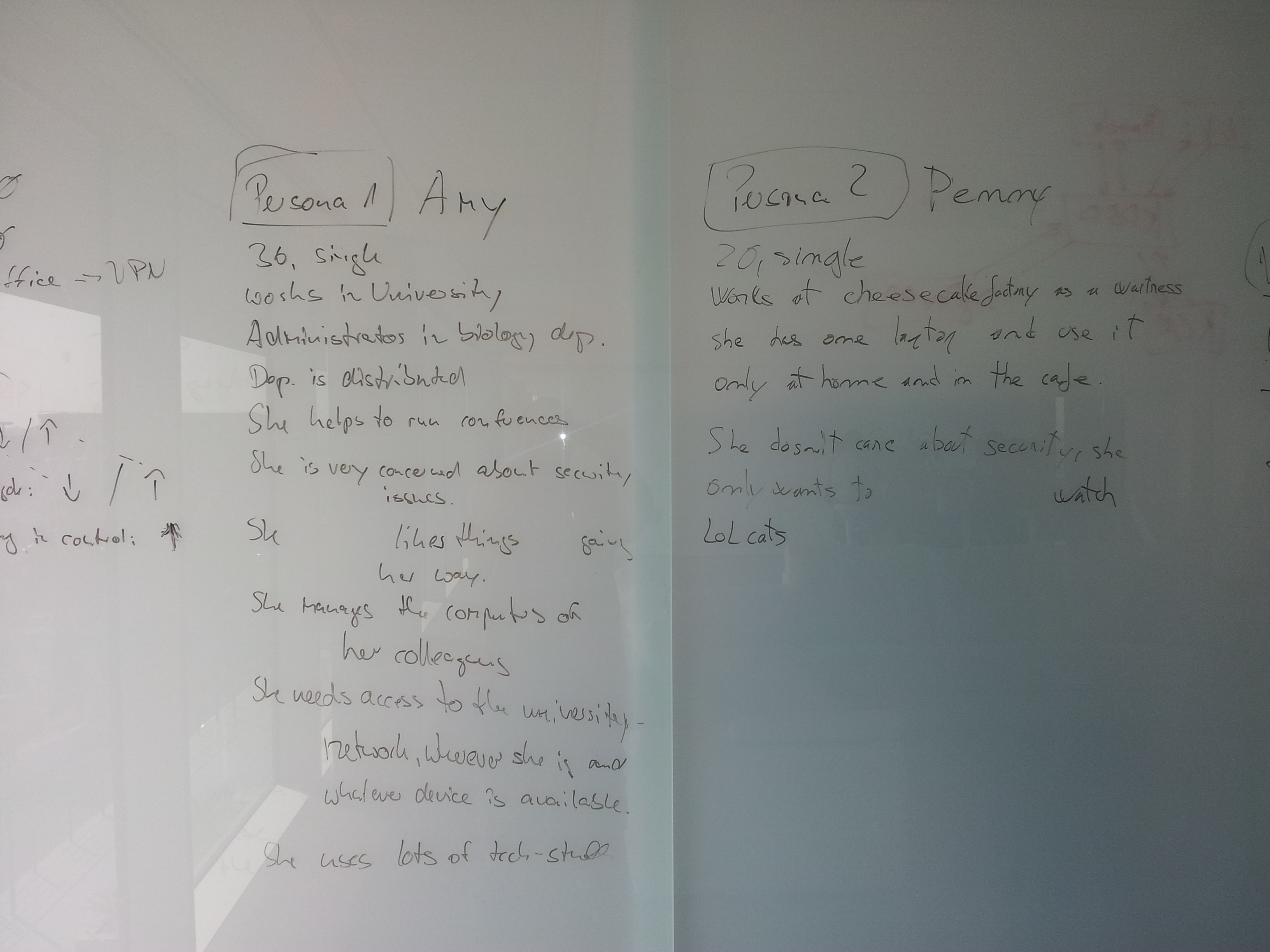
After we defined the vision of Network Management (basically how and in what we think NM should help users) we needed to decide the kind of users we're targeting, for doing that we defined two personas each in one corner case, one is computer science profesional and the other one is only interested in watching lolcats :p
Penny: She is only interested in "being" online not into "get" online, meaning that she wants stuff to work out of the box or at least without bothering her alot.
Amy: She is a sysadmin, she wants to be able to configure all the possible options out there .
(Click on the name to read the full persona description).
So, once we got our two personas defined and the main target selected (Penny) the next step was to list a few places where each persona will use Network Management, for example: "Penny's home, train, park...". Finally we went through all possibilities imagining what our personas will want to do in that location.
The funny thing about this is that we end up thinking like our personas will do, trying to make our best so Penny will be happy while Amy won't be bothered. And you want to know another funny thing? we discovered that by making Penny's life easier we were making Amy's easier as well, no matter if Amy is an "advanced user".
I can't talk by others, but I will think as Penny from now on when I'm designing workspace stuff.
